REBRANDING CONCEPT · SUMMER 2025
Lakers Rebrand Proposal

ROLE
Marketing Executive
Graphic Designer
TIMELINE
July - August 2025
SKILLS
Product Design
Strategic Thinking
TEAM
1 Marketer
OVERVIEW
Project Summary
The Los Angeles Lakers are one of the most successful and culturally influential franchises in NBA history. A legacy of legends and a global fan base, the Lakers represent more than just basketball, they’re a symbol of winning, loyalty, and West Coast identity.
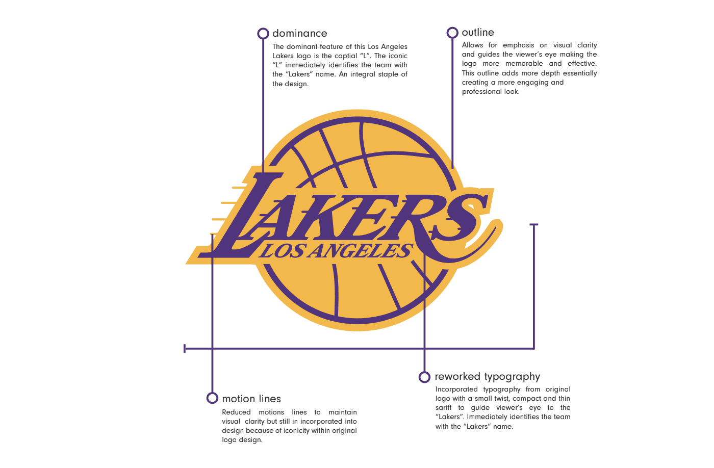
This rebrand seeks to modernise the team’s visual identity while preserving its iconic legacy.
The aim is to strike a balance between heritage and modernisation, paying homage to the team’s historical significance while positioning the brand for a new generation of fans in an evolving digital and global landscape. Through refined typography and various design applications, this proposal presents a bold yet respectful evolution of the iconic Lakers brand, one that is timeless, adaptable, and without a doubt LA.
HISTORY
Lights, Fast Breaks, Action: The Showtime Lakers
Showtime was an era defined by an exciting, fast-paced, run‑and‑gun style of basketball from the Los Angeles Lakers, spanning from 1979 to 1991. The Showtime Lakers dominated for 12 years and captured five championships.
For this rebrand, the goal was to channel that thrilling, innovative style of play. With an organisation as historically significant and beloved as the Lakers, a simple brand refresh would never do the franchise, or its fans, justice.
Key design elements that shaped the original Showtime identity have been reimagined and integrated into this redesign, now expressed through a more modern and sleek visual language.

The Showtime era wasn’t just defined by fast breaks and no‑look passes, it was visually iconic. The uniform design, particularly the wordmark and number styling, worked together to capture the essence of a team that blended Hollywood flair with a championship mentality.
At the centre of the jerseys was the “Lakers” wordmark: a custom, italicised serif deliberately slanted forward. This intentional design choice mirrored the team’s fast‑tempo identity under head coach Pat Riley: forward‑thinking, fast, and flashy. The tilt of the letters suggested momentum, reflecting the Lakers’ transition play and rising star power.
Beneath the wordmark, the block‑style numbers grounded the uniform with strength and stability. In contrast to the fluidity of the wordmark, these numbers were bold, squared‑off, and unapologetically solid. This stoic aesthetic embodied the team’s physical and defensive presence, players like James Worthy and Kareem Abdul‑Jabbar, whose dominance was anything but delicate.

Together, the uniform wordmark and number design created a distinct visual language: showmanship balanced with class and structure.
This identity remains one of the most memorable in sports history. Any alteration must honour the delicate heritage that made it so iconic and ensure that its impact is preserved rather than diluted.

Lakers
Gold
pantone: PMS 123 C
hex colour: #FDB927;
rgb: (253, 185, 39)
cmyk: (0, 30, 94,0)
signifies the team’s success, and championship mentality. an icon and symbol to this organisation.
Lakers
Purple
pantone: PMS 526 C
hex colour: #552583;
rgb: (85, 37, 130)
cmyk: (79, 100 , 0, 12)
regal connotation, a symbol of glamour. represents the team’s rich history.


It's showtime.
DESIGN
Logo Set


DESIGN
Logo Set II


DESIGN
Logo Set III
DESIGN
Jersey Showcase


DESIGN
Jersey Showcase II

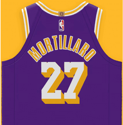
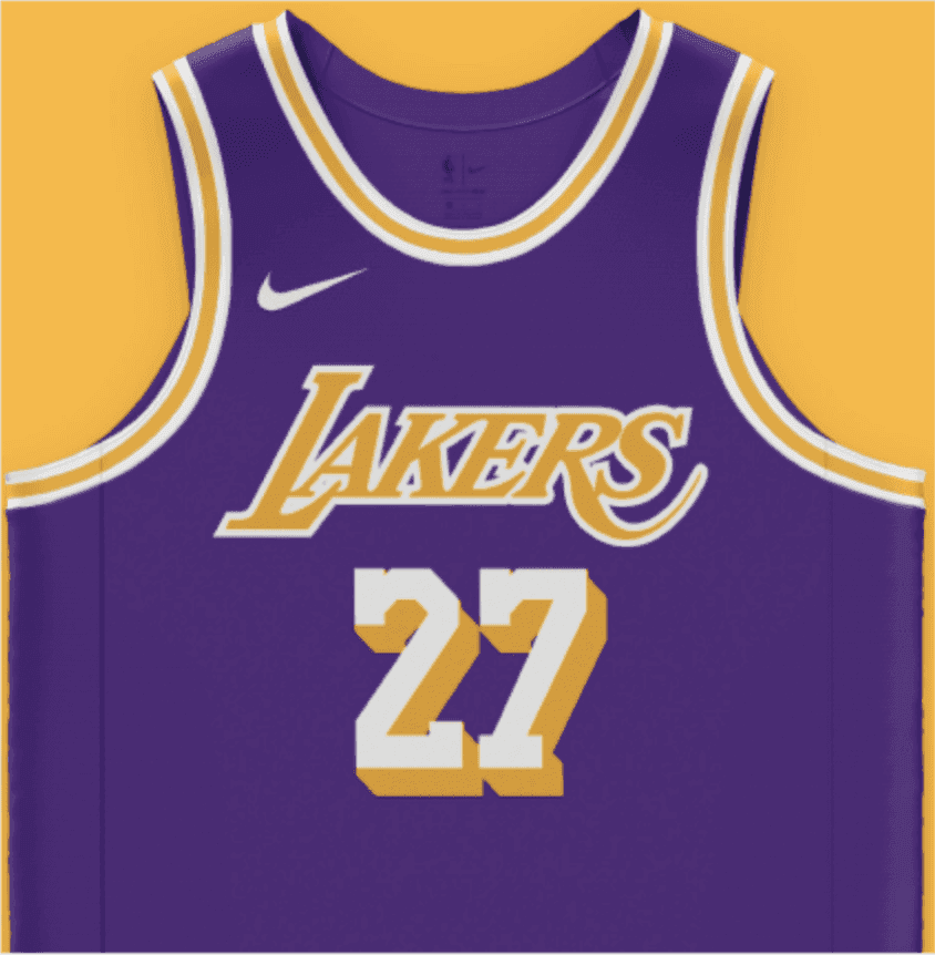
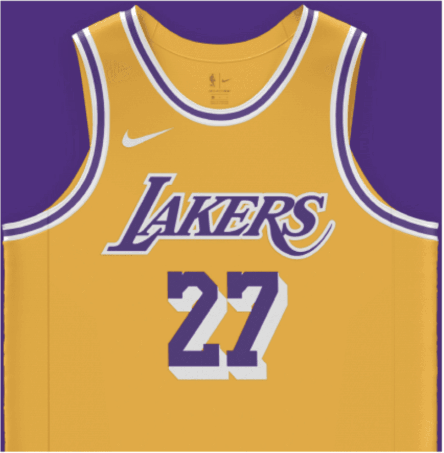
I am very happy with how the jersey designs came out. It was a lengthy process, but it turned out exactly how I envisioned it. The classic Lakers’ gold and purple was a no‑brainer in the development and final product of the revised jerseys, as well as the custom uniform wordmark. It just screams Showtime Lakers.
I also wanted to challenge myself creatively and explore how other cornerstones of LA culture can be incorporated into another jersey design for the Lakers. Iconic symbols of LA culture such as In‑and‑Out, the Hollywood Sign, palm trees, etc. were considered; however, it was challenging to create an original idea.
That led me to the LA Dodgers, an equally iconic sports organisation whose clean white‑and‑blue aesthetic has also become a symbol of the city in its own right, where I felt I was able to create a uniform that hasn’t been seen before. So, I developed jerseys inspired by the Dodgers, blending the visual aesthetic of baseball with the flair and energy of basketball to celebrate LA’s sports culture.

When I set out to design this jersey, my vision was simple: to unite two of Los Angeles’ most iconic franchises into one bold piece. I wanted to create a Statement Edition uniform that goes beyond the court, something that incorporates a staple of LA sports legacy, paying tribute to the powerhouses that have shaped the city’s identity for generations.
The result is a jersey that channels the Dodgers’ timeless aesthetic while staying true to the Lakers’ tradition of flair. The Dodger blue base immediately commands attention, a clean canvas that represents the city’s baseball heritage. Subtle pinstripes run vertically, adding depth and rhythm, echoing the Dodgers’ classic home uniform.
Across the chest, the “Lakers” script wordmark flows in smooth, cursive strokes, a direct homage to the Dodgers’ iconic typography, but reimagined for the hardwood. Below it, the block‑style red numbers stand out with confidence, a sharp and modern counterbalance to the fluidity of the wordmark. Together, they strike a balance between elegance and power, flair and stability.
Every minute detail tells a story. The white piping along the collar and armholes mirrors baseball’s traditional uniform accents, while the Jordan Brand logo gives it a sleek, modern edge. The presence of blue, white, and red connects past and present, tradition and reinvention, capturing the spirit of Los Angeles as both timeless and ever‑evolving.
This is a cultural bridge. It's a design that celebrates the shared legacy of the Lakers and Dodgers, two dynasties defined by excellence, spectacle, and a city that demands nothing less.
DESIGN
Jersey Showcase III


Overall, I’m extremely pleased with the final outcome of the jersey designs and the refreshed logo. This project not only highlights my technical capabilities across Photoshop, Illustrator, and InDesign, but also demonstrates my ability to craft cohesive, high‑impact visual assets across both print and digital platforms.
The redesigned Lakers uniforms and updated logo capture the historic flair and championship DNA of the Showtime era, while introducing a modern edge that positions the brand for the next generation of fans. It’s a balance of heritage and innovation, true to the franchise’s legacy, yet ready for its future.
This project also gave me the opportunity to explore my passion for magazine editorials and high‑end fashion. I’ve long envisioned creating a basketball publication styled like a fashion editorial, blending sport, design, and culture into a visually compelling narrative.
Basketball is more than a game, and this experience offered a glimpse into how that vision could come to life. It’s a direction I’m excited to continue developing in future projects, whatever they may be.
REFLECTION
What I Learned
Strategic intent.
Understanding how creative decisions can be rooted in brand positioning, audience perception and commercial objectives, rather than simply aesthetics.
Evolution.
Learning how to take an established brand with decades of cultural equity and reinterpret it for a new generation without losing what makes it distinctive.
Like what you see?
Let's talk about products, collaborations, or anything design!
